 Back to the Barnyard (Views:
3,264
)
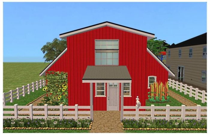
Property Type: Residential
Condition: Fully Furnished
Bedrooms: 2
Price: §66,711
Lot Size: 2×2
Extra Info:
Contains custom content
Content is included
It was so nice to build a small lot that took a day caompared to an oversized one that takes two months!
Important Bits
Two Bedrooms
Two Bathrooms
Kitchen
Lounge
Dining
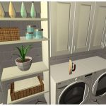
Laundry
While I managed to build something small and not too expensive, I couldnt stop the CC!
Credit where Credit due:
Lady Angel, Fresh Prince, Leeseter, Kevinscool, Mystic Rain, Curious B, Atgnet, JLonier, Jope, Mustluvcatz, Holy Simoly, tBudgett
Required Expansion Packs:

Required Stuff Packs:


You must be a logged in member to download this file

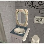
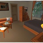
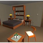
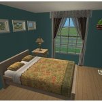
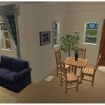
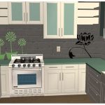
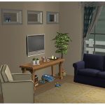
Love this Tiff, and love your use of CC, especially those wall paintings.
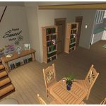
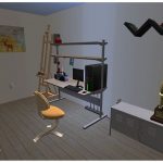
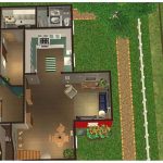
I love the bits of angled furniture here and there, they make the house look so lived in and realistic. And the sockets and floor vents are such a perfect touch too! The kitchen is my favorite room – I really like those counters and cabinets!
I absolutely LOVE the finishing touch CC does!! Makes mine look so dull compared to your’s Well Done!!!! When I grow up I wanna be just as good as all you so very talented Creator’s 😀 😛
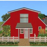
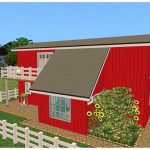
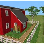
This is gorgeous, and so very deceptive! It’s much bigger inside than it looks, very nice!
Thanks guys for the nice comments 🙂
I agree with Lady A ^^
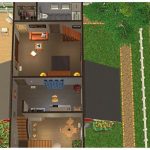
The layout is just brilliant matching the shape of the building and it just doesn’t looked cramped at all. You really captured that barn feeling inside and out. I don’t think I would change a thing 🙂
What a cute little house, love the lay out.